Style the widget like a customer help chat
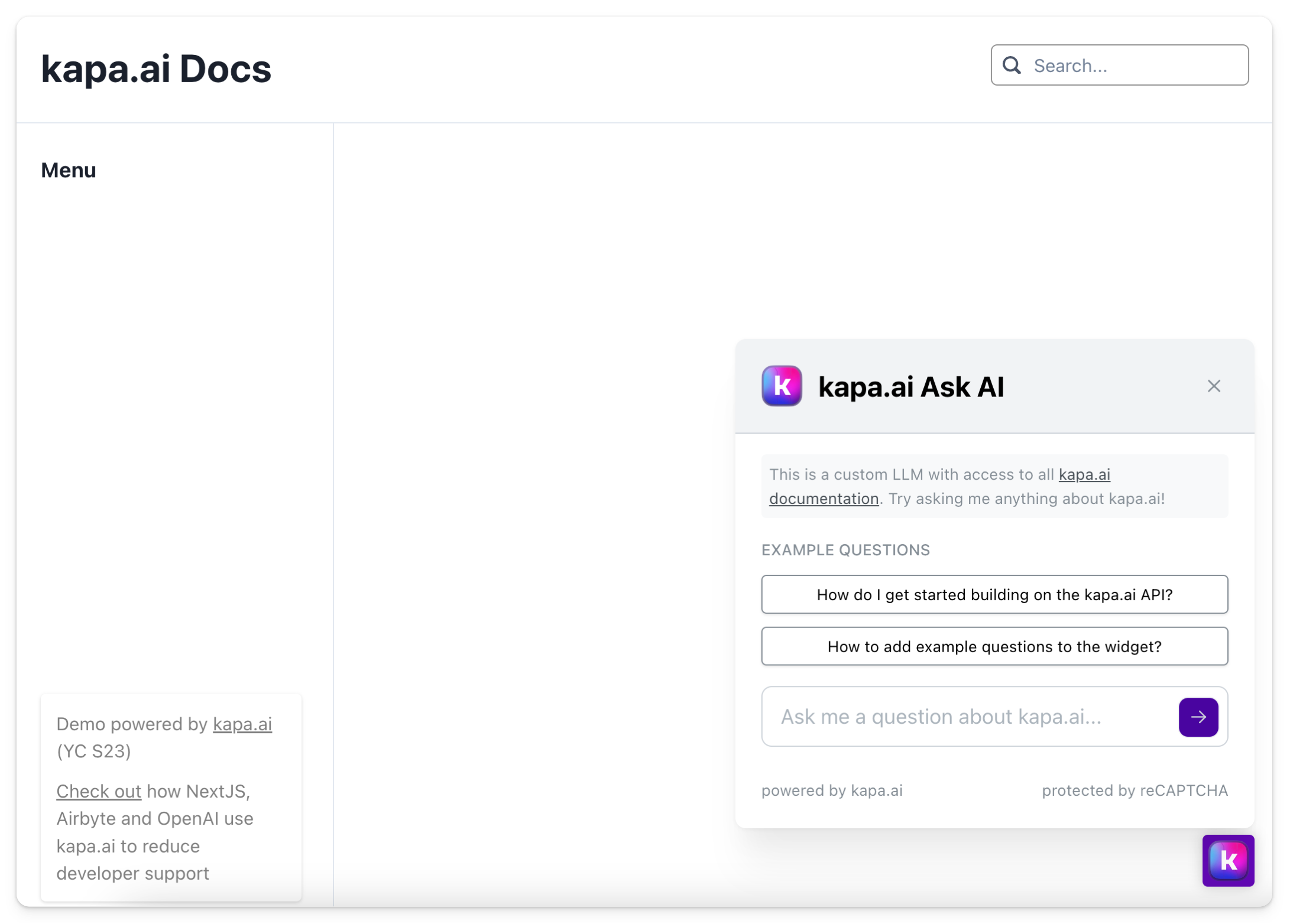
You can configure the Kapa widget to appear open by default at the bottom of your page. This is particularly useful for support sites or documentation where you want the AI assistant to be immediately visible and accessible.
Standard Configuration
By default, the Kapa widget is usually implemented with a script tag like this:
<script
  async
  src="https://widget.kapa.ai/kapa-widget.bundle.js"
  data-website-id="XXX-XXX-XXX"
  data-project-name="kapa.ai"
  data-project-color="#6306B6"
  data-project-logo="kapa.ai/assets/logo.png"
  data-modal-disclaimer="This is a custom LLM with access to all [Kapa documentation](https://docs.kapa.ai)."
  data-modal-example-questions="How do I get started?,How to add example questions?"
  data-user-analytics-fingerprint-enabled="true"
></script>
Extended Configuration for Open Bottom Widget
To make the widget appear open at the bottom of the page, add the following parameters to your script tag:
<script
  async
  src="https://widget.kapa.ai/kapa-widget.bundle.js"
  data-website-id="XXX-XXX-XXX"
  data-project-name="kapa.ai"
  data-project-color="#6306B6"
  data-project-logo="kapa.ai/assets/logo.png"
  data-modal-disclaimer="This is a custom LLM with access to all [Kapa documentation](https://docs.kapa.ai)."
  data-modal-example-questions="How do I get started?,How to add example questions?"
  data-user-analytics-fingerprint-enabled="true"
  data-modal-x-offset="0"
  data-modal-y-offset="0"
  data-modal-with-overlay="false"
  data-modal-inner-flex-direction="column"
  data-modal-inner-justify-content="end"
  data-modal-inner-max-width="400px"
  data-modal-inner-position-left="auto"
  data-modal-inner-position-right="20px"
  data-modal-inner-position-bottom="calc(2.5rem + 25px)"
  data-button-height="2.5rem"
  data-button-width="2.5rem"
  data-button-text=" "
  data-conversation-button-icons-only="true"
  data-modal-size="60%"
  data-modal-lock-scroll="false"
></script>
Additional Parameters Explained
The following parameters are added to create the open-bottom effect:
data-modal-x-offset="0"anddata-modal-y-offset="0": Positions the widget at the edge of the viewport.data-modal-with-overlay="false": Removes the overlay, allowing interaction with the page behind the widget.data-modal-inner-flex-direction="column"anddata-modal-inner-justify-content="end": Aligns the widget to the bottom of its container.data-modal-inner-max-width="400px": Sets a maximum width for the widget.data-modal-inner-position-*: Fine-tunes the position of the widget.data-button-height="2.5rem"anddata-button-width="2.5rem": Sets the size of the toggle button.data-button-text=" ": Removes text from the toggle button, leaving only the icon.data-conversation-button-icons-only="true": Uses only icons for conversation buttons to save space.data-modal-size="60%": Sets the widget to occupy 60% of the viewport height.data-modal-lock-scroll="false": Allows scrolling on the main page when the widget is open.
By adding these parameters, your Kapa widget will appear open by default at the bottom right of your page, providing an immediately accessible AI assistant for your users.