Widget best practices
You can configure the Kapa widget to best suit your specific deployment page. Optimizing the widget UI is a great way to increase the number of questions users ask Kapa. There are several approaches you can take to deploy the widget:
- Standard widget deployment - The default floating button that appears on your site
- Custom button activation - Your own UI elements that trigger the Kapa widget
- Search integration - Connecting Kapa with your existing search functionality
Deployment best practices
From styling and positioning of the UI itself, to additional entry points for the widget, here are some best practices that can help you improve widget visibility and usage:
Use high-contrast colors
To ensure that users notice the Kapa widget, we recommend using a different color that visually stands out compared to the background on your documentation page.
To change the color of the button, use the data-button-bg-color and
data-button-text-color parameters. Refer to the widget configuration
reference for more options.
Deploy where your users are
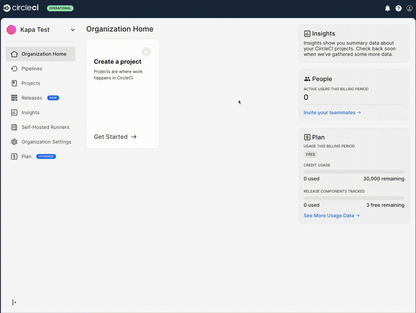
Kapa can be deployed across any website or web app, not just on documentation sites. This allows Kapa to provide immediate answers wherever your users are likely to have questions, whether they're navigating a complex documentation site, browsing community forums, or even using an application. For example Mapbox, Monday.com, and CircleCI integrated the Kapa widget directly in-app to enhance user retention by offering instant support without leaving the app but also enriching the overall user experience by reducing frustration and improving accessibility for support.
When you add the widget to a new website or application, add a script tag like you would with a regular website per the installation instructions. We recommend creating a new widget integration for each major deployment, to make it easy to distinguish between conversations on different platforms. Remember to whitelist the domains where you're deploying to in the widget setup to avoid CORS issues.
Add more entrypoints
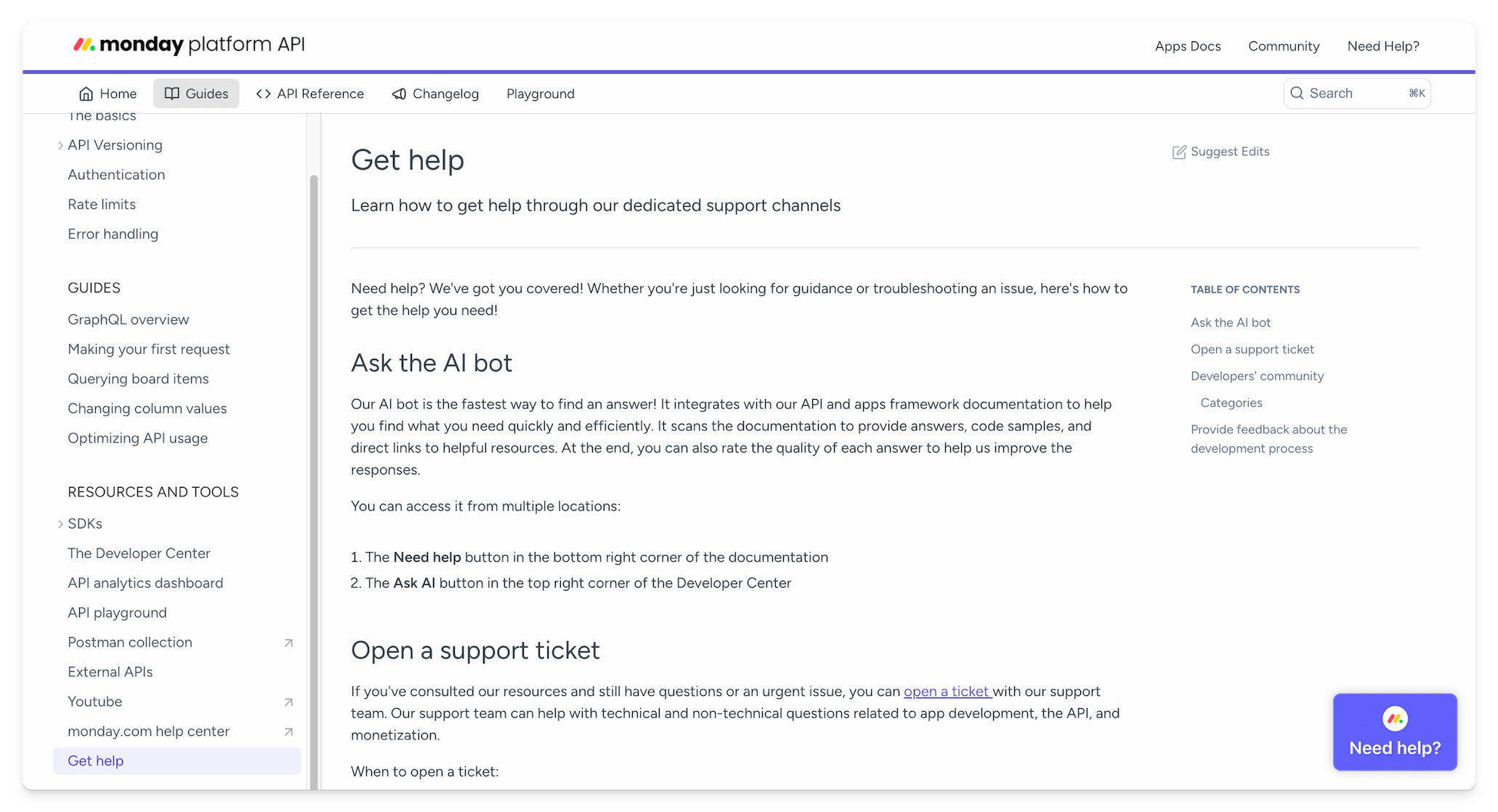
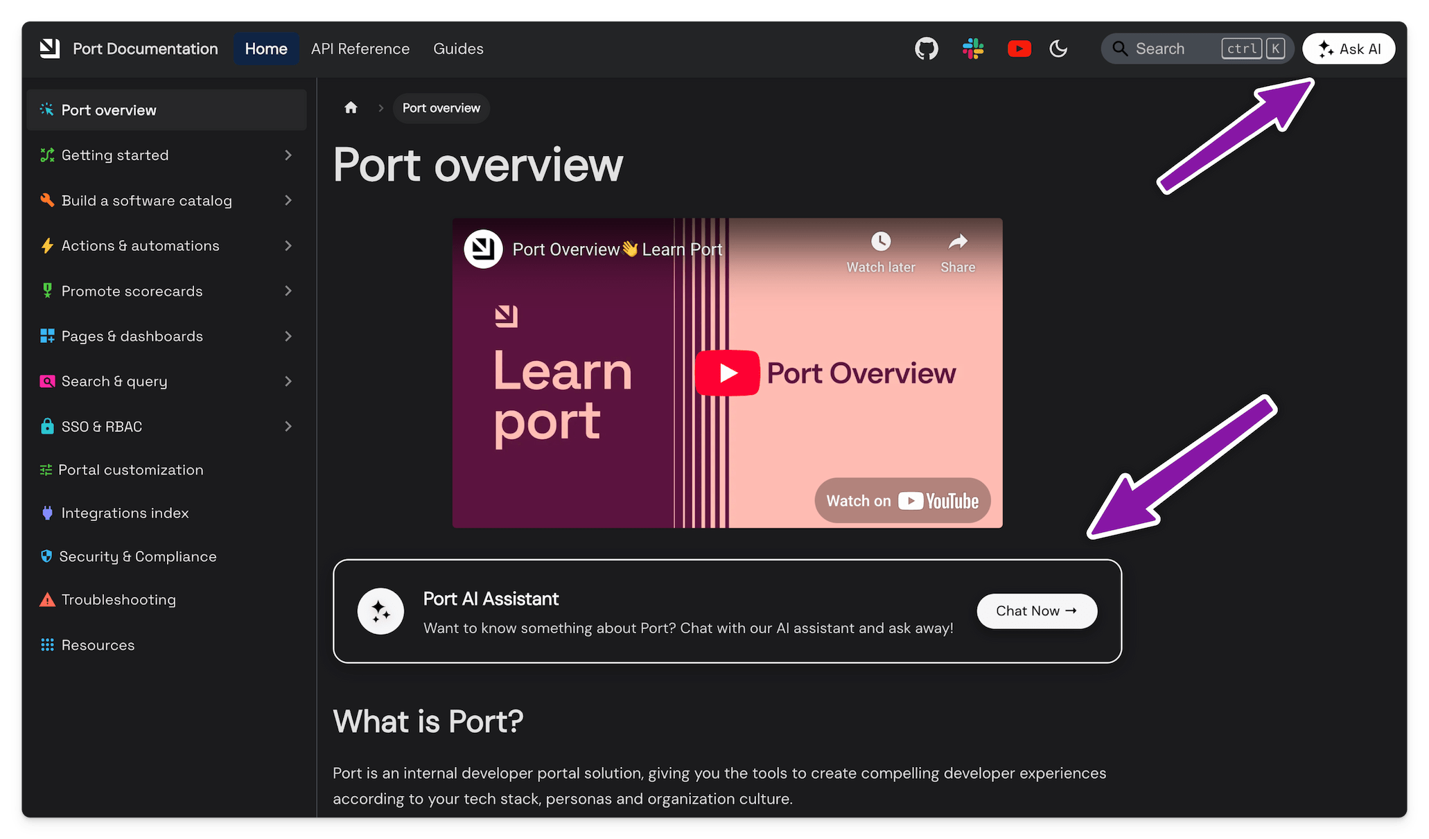
Additional entrypoints to Kapa ensures that your users don't miss it. Adding a custom "Ask AI" to your website's header and other places is a common pattern that usually works well to capture user's interest. Port includes Kapa in the website header and as custom call-to-action buttons on the overview page.
To have a custom button open the Kapa widget, use the
data-modal-override-open-id or data-modal-override-open-class configuration
parameters pointing to a button with the specified ID or class, and the
corresponding markup in your website's HTML:
<button id="custom-ask-ai-button">✨ Ask AI</button>
Refer to the widget configuration reference for more options.
Integrate with search
Many documentation sites include traditional search functionality alongside Kapa's Ask AI widget. While users are accustomed to using search to find information, keyword-based search often returns multiple results that require further investigation. By integrating Kapa with your existing search solution, you can offer users a more direct path to answers. When search results appear, present Kapa as an alternative that can provide synthesized, contextual responses rather than requiring users to browse through multiple documents.
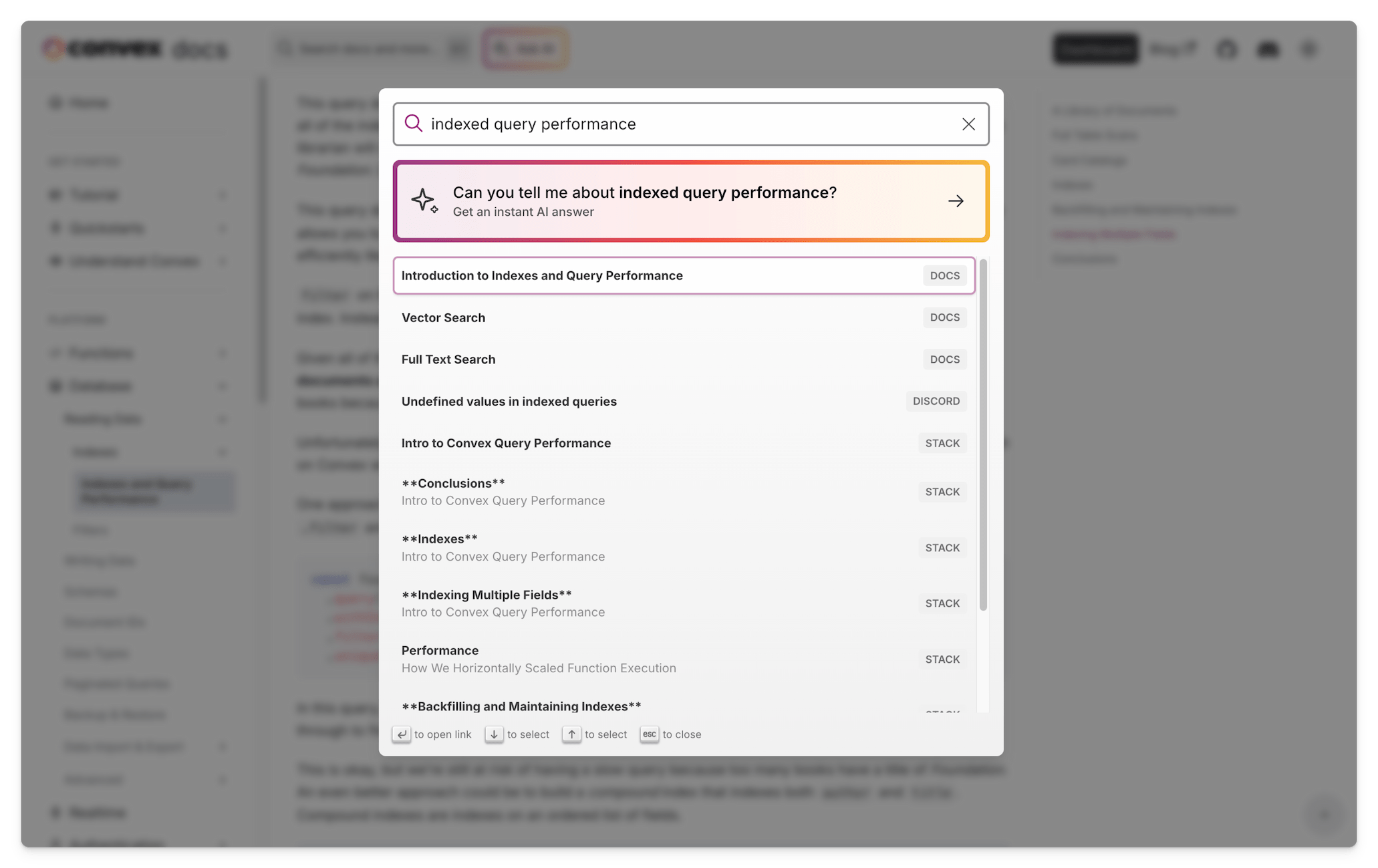
If you use Algolia, take a look at this tutorial that demonstrates how to integrate Kapa with React InstantSearch.
Monitor and iterate
Implementing the best practices above can significantly increase user engagement with your Kapa widget. Each additional touchpoint creates more opportunities for users to discover and benefit from Kapa's AI assistance.
After deployment, use the Kapa dashboard analytics to monitor how users interact with the widget. Pay attention to:
- Which pages generate the most widget interactions
- What types of questions users are asking
- How different entry points perform compared to one another
Use these insights to continuously refine your implementation strategy. The most effective widget deployments evolve based on actual user behavior data.