Behavior
Below is a detailed list of all configuration options that control the Website Widget's behavior. These are set as data- attributes on the script tag. For styling and component customization, see Component Styles.
Required parameters
The following parameters are required to configure the Website Widget:
| Parameter | Description |
|---|---|
data-website-id | The Integration ID from your widget integration in the Kapa platform. |
data-project-name | Set the name to be displayed at the top of the widget modal. |
data-project-color | Your brand's color in hexadecimal format (e.g., #FF0000), this color is inherited by multiple components within the widget and may impact visibility of certain components. |
data-project-logo | Provide a link to the logo you want to use (a square format is recommended). |
Here is an example with the required parameters and a few recommended optional parameters:
<script
  async
  src="https://widget.kapa.ai/kapa-widget.bundle.js"
  data-website-id="XXX-XXX-XXX"
  data-project-name="kapa.ai"
  data-project-color="#6306B6"
  data-project-logo="https://example.com/logo.png"
></script>
Optional parameters
Language
| Parameter | Description | Default Value |
|---|---|---|
data-language | Set the widget's UI language. This only changes the UI strings. Users can still ask questions in any language. | "en" |
The following languages are supported:
| Language | Language Code |
|---|---|
| English | "en" |
| Chinese | "zh" |
| Czech | "cs" |
| Dutch | "nl" |
| French | "fr" |
| German | "de" |
| Italian | "it" |
| Japanese | "ja" |
| Korean | "ko" |
| Portuguese | "pt" |
| Russian | "ru" |
| Spanish | "es" |
<script
  src="https://widget.kapa.ai/kapa-widget.bundle.js"
  data-website-id="your-website-id"
  data-language="zh"
  ...
></script>
Modal behavior
The default behavior is to open the modal on clicking the Ask AI button. If you want to override this behavior, you can set the following parameters:
| Parameter | Description | Default Value |
|---|---|---|
data-modal-open-by-default | Set to "true" to open the modal by default when loading it on a page. | "false" |
data-modal-open-on-command-k | Set to "true" to enable opening the modal with Cmd+K (or Ctrl+K on Windows/Linux). | "false" |
data-modal-command-k-search-mode-default | Set to "true" to open in search mode when the widget is triggered via Cmd+K. Only relevant when search mode is enabled. | "false" |
data-modal-override-open-selector | Set to a CSS selector (e.g., "button[data-action='open']") to override the modal open behavior. Clicking any element matching this selector opens the modal. | Not set |
data-modal-override-open-selector-search | Set to a CSS selector to open the modal in search mode when the matching element is clicked. | Not set |
data-modal-override-open-selector-ask-ai | Set to a CSS selector to open the modal in ask-AI mode when the matching element is clicked. | Not set |
data-modal-override-open-class | Set to a CSS class name to open the modal when any element with this class is clicked. | Not set |
data-modal-override-open-class-search | Set to a CSS class name to open the modal in search mode when any element with this class is clicked. | Not set |
data-modal-override-open-class-ask-ai | Set to a CSS class name to open the modal in ask-AI mode when any element with this class is clicked. | Not set |
data-modal-override-open-id | Set to an element ID to open the modal when that element is clicked. | Not set |
data-modal-override-open-id-search | Set to an element ID to open the modal in search mode when that element is clicked. | Not set |
data-modal-override-open-id-ask-ai | Set to an element ID to open the modal in ask-AI mode when that element is clicked. | Not set |
data-render-on-load | Determines whether the widget is rendered immediately when the script loads. Set to "false" to defer rendering and trigger it later using window.Kapa.render(). | "true" |
Search configuration
By default, the search mode is not enabled. You can enable it and customize its behavior with the following parameters:
| Parameter | Description | Default Value |
|---|---|---|
data-search-mode-enabled | Set to "true" to enable the search mode. | "false" |
data-search-mode-default | Set to "true" to set search as the default mode when the widget is opened. | "false" |
data-search-keyboard-nav-enabled | Set to "false" to disable keyboard navigation in search results. | "true" |
data-search-source-ids-include | Define the set of source IDs to be included in the search. Kapa excludes the other sources. Source IDs can be found in the Kapa platform: go to Sources, select the source name, then get the ID from the URL. Example: "id1,id2,id3". If you use both this and data-source-group-ids-include, Kapa restricts search to sources in both lists. | Not set |
data-search-source-ids-order | Define the order in which sources should be grouped in the search results list. Comma-separated list of source IDs. | Not set |
Source groups
| Parameter | Description | Default Value |
|---|---|---|
data-source-group-ids-include | Comma-separated list of source group IDs to limit the widget's knowledge base. When set, the widget only uses sources from the specified groups (plus any global sources). Example: "group-id-1,group-id-2". See source groups documentation for details. | Not set |
Bot protection
| Parameter | Description | Default Value |
|---|---|---|
data-bot-protection-mechanism | Determines the captcha service on the widget that provides protection from bots and other abuse. To use hCaptcha instead of reCAPTCHA, set to "hcaptcha". | "recaptcha" |
Analytics
By default, the widget performs anonymous user tracking and collects anonymous user feedback through satisfaction surveys. You can disable these features with the following parameters:
| Parameter | Description | Default Value |
|---|---|---|
data-user-analytics-cookie-enabled | Set to "false" to disable anonymous user tracking via cookies. | "true" |
data-user-analytics-fingerprint-enabled | Set to "true" to enable browser fingerprinting for user identification. Takes precedence over cookie tracking when enabled. | "false" |
data-user-satisfaction-feedback-enabled | Set to "false" to prevent the satisfaction survey from being shown to users. | "true" |
Conversation handoff
Enable an in-widget Create ticket button that emails the conversation, plus any extra notes the user provides in the form, to an address you configure. See Conversation handoff for a full walkthrough.
| Parameter | Description | Default Value |
|---|---|---|
data-handoff-email | The address that receives ticket emails. Setting this enables the feature. | Not set |
data-handoff-triggers | Comma-separated list controlling when the button appears: always, conversation-length, uncertainty, downvote. The button shows when any listed trigger matches. | "always" |
data-handoff-conversation-length-threshold | Minimum number of question-answer pairs before the conversation-length trigger fires. | 3 |
Customization
| Parameter | Description | Default Value |
|---|---|---|
data-customization-id | The ID of a customization to apply to this widget. When set, every chat request uses the specified customization's prompt overrides. | Not set |
Advanced
| Parameter | Description | Default Value |
|---|---|---|
data-uncertain-answer-callout | An additional message, formatted as Markdown, that is directly appended to the answer when uncertainty is detected. | Not set |
data-consent-required | Set to "true" to require user consent before using the widget. Enabling this sets a kapa_consent cookie in the browser. | "false" |
Component-specific behavioral parameters like button text, modal titles, consent screen text, and input placeholders are configured through the component styling system. For example, data-launcher-button-text, data-modal-title-text, data-consent-screen-title, and data-ask-ai-input-placeholder are documented in the Component Styles page under their respective component sections.
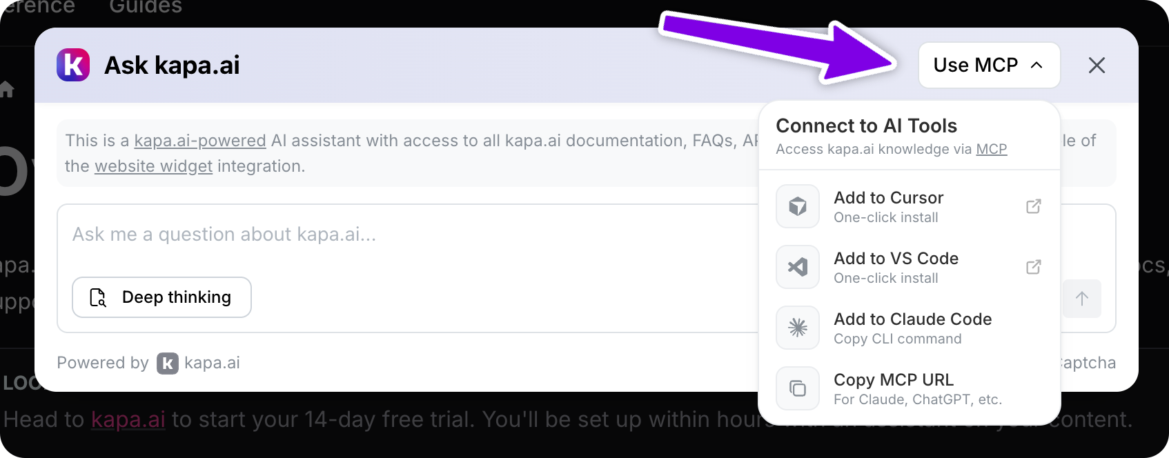
MCP install menu
You can add an install menu to the widget header that promotes your Hosted MCP server and helps users connect to your knowledge base from popular AI tools like Cursor, VS Code, Claude (Code and Desktop), and ChatGPT. You must have a hosted MCP server set up before enabling this feature.
| Parameter | Description | Default Value |
|---|---|---|
data-mcp-enabled | Set to "true" to enable the MCP dropdown in the widget. | "false" |
data-mcp-server-url | The MCP server URL for your docs (e.g., "https://your-project.mcp.kapa.ai"). Required when MCP is enabled. | Not set |
The MCP button visibility and text can be configured through data-mcp-button-hidden and data-mcp-button-text on the Component Styles page.