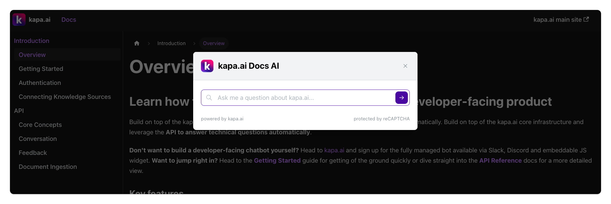
Website Widget
Kapa can be installed as a widget on any website or documentation hosting provider. The widget allows users to ask questions in natural language about your product which improves developer experience as developers can find answers to their questions faster. The widget is fully customizable and can be styled to match your brand.
Check out the example deployments to see examples of how companies like CircleCI, Prisma, and Mapbox style and use the kapa widget to improve their developer experience.
Step 1: Configure Project Parameters 🔧
Required Parameters 📝
The following parameters are required to configure the website widget:
data-website-id: Obtain this ID from the kapa.ai team for your website.data-project-name: Set the name to be displayed at the top of the website widget.data-project-color: Choose the default color for the widget (use a HEX color code).data-project-logo: Provide a link to the logo you want to use (a square format is recommended).
Here is an example for the kapa.ai widget we use on our website below:
data-website-id: XXX-XXX-XXX
data-project-name: kapa.ai
data-project-color: #6306B6
data-project-logo: kapa.ai/assets/logo.png
Optional Configuration Parameters 🎨
In addition to above required parameters, you can also add the following optional parameters to customize the website widget:
General Configuration
Parameters and toggles to customize the widget.
Modal and button behavior: The default behavior is to open the modal on clicking the "Ask AI" button. If you want to override this behavior, you can set the following parameters:
data-button-hide: Set to"true"to hide the button. Default is not set.data-modal-override-open-class: Set to a class name (e.g.,"my-search-bar-class") to override the modal open behavior. Default is not set.data-modal-override-open-class-search: Set to a class name (e.g.,"my-search-bar-class") to override the modal open behavior with the search mode being the default.data-modal-override-open-class-ask-ai: Set to a class name (e.g.,"my-search-bar-class") to override the modal open behavior with the ask-ai mode being the default.data-modal-open-by-default: Set to"true"to open the modal by default when loading it on a page. Default is not set.data-modal-open-on-command-k: Set to"true"to enable opening the modal withCmd+K. Default is set to"false".
Text and image customization: You can customize the text that appears in the widget by setting the following parameters:
data-modal-title: Set the title for the modal. Default is"[project name] Docs AI".data-modal-disclaimer: Set a disclaimer to appear at the top of the modal (e.g., results are AI generated). Default is not set.data-modal-example-questions: Comma separated list of example questions to show in the modal (e.g., "How do I get started?,What Python version do I need?"). Default is not set.data-modal-ask-ai-input-placeholder: Set the placeholder text for the Ask AI input field. Default is"Ask me a question about [project name]...".data-modal-search-input-placeholder: Set the placeholder text for the Search mode search bar. Default is"Search sources...".data-modal-image: Provide a URL for the image in the modal header. Default is[project-logo].data-modal-image-hide: Set to"true"to hide the image in the modal. Default is not set.data-button-image: Provide a URL for the image in the button. Default is[project-logo].data-button-text: Set the text for the search button. Default is"Ask AI".
Search configuration: By default, the search mode is not enabled. You can enable it and customize its behaviour with the following parameters:
data-search-mode-enabled: Set to"true"to enable the search mode. Default is"false".data-search-mode-default: Set to"true"to set search as the default mode when the widget is triggered. Default is"false".data-modal-command-k-search-mode-default: Set to"true"to set search as the default mode when the widget is triggered via Cmd + K. Default is"false".data-search-display-num-results: The amount of results displayed in each "page", i.e. before the user needs to hit "Show more". Default is"5".data-search-include-source-names: Define the set of source names that should be included in the search. All remaining sources will not be retrieved. You can find the source name in the kapa dashboard. Default is not set.data-search-source-group-order: Define an order of source names by wich sources should be grouped in the results list. Default is not defined.data-search-keyboard-nav-enabled: Set to"false"if you would like to disable keyboard navigation. Default is"true".
Style Configuration
A set of parameters to configure the components' styles. You can assign any valid CSS value to these properties.
Global
data-font-family: Default is"-apple-system,BlinkMacSystemFont,Segoe UI,Roboto,Helvetica,Arial,sans-serif,Apple Color Emoji,Segoe UI Emoji;".
Button
The default positioining is 20px from bottom right corner. If you want to configure this you can set the distance from the edge of the page (in pixels) where the widget will appear.
data-button-position-top: Default is not set.data-button-position-right: Default is"20px".data-button-position-bottom: Default is"20px".data-button-position-left: Default is not set.
You can further adjust the button apprearance to your needs.
data-button-z-index: Default is"199".data-button-height: Default is"5rem".data-button-width: Default is"4.5rem".data-button-padding: Default is"0".data-button-bg-color: Default is not set.data-button-border-radius: Default is not set.data-button-border: Default is not set.data-button-box-shadow: Default is"0 0 10px rgba(0, 0, 0, 0.2)".data-button-image-height: Default is"32".data-button-image-width: Default is"32".data-button-text-font-size: Default is not set.data-button-text-font-weight: Default is not set.data-button-text-font-family: Default is not set.data-button-text-color: Default is not set.data-button-text-shadow: Default is"1px 1px 2px rgba(0, 0, 0, 0.2)".
Modal
Style parameters for the modal which pops up when triggering the widget.
data-modal-close-button-hide: Default is"false".data-modal-z-index: Default is"200".data-modal-size: Default is"640px".data-modal-full-screen: Default is"false".data-modal-full-screen-on-mobile: Default is"true".data-modal-lock-scroll: Prevents scrolling on the page behind the modal. Default is"true".data-modal-x-offset: Default is not set. On mobile, this has no effect if full screen is set.data-modal-y-offset: Default is"10vh". On mobile, this has no effect if full screen is set.data-modal-border-radius: Default is set to"0.5rem".data-modal-disclaimer-bg-color: Default is set to"#F8F9FA".data-modal-disclaimer-text-color: Default is set to"gray".data-modal-disclaimer-font-size: Default is set to"0.75rem".data-modal-header-logo-hide-on-mobile: Default is set to"false".data-modal-header-min-height: Default is set to"48px".data-modal-header-padding: Default is set to"20px".data-modal-header-padding-top: Default is not set.data-modal-header-padding-right: Default is not set.data-modal-header-padding-bottom: Default is not set.data-modal-header-padding-left: Default is not set.data-modal-header-bg-color: Default is"#F1F3F5.data-modal-header-border-bottom: Default is"1px solid #CED4DA.data-modal-body-bg-color: Default is not set.data-modal-body-padding-top: Default is"8px".data-modal-body-padding-right: Default is"20px".data-modal-body-padding-bottom: Default is"20px".data-modal-body-padding-left: Default is"20px".data-modal-title-font-family: Default is not set.data-modal-title-font-size: Default is not set.data-modal-title-font-weight: Default is not set.data-modal-title-color: Default is not set.data-modal-image-height: Default is set to"32".data-modal-image-width: Default is set to"32".data-modal-with-overlay: Default is"true".data-modal-inner-flex-direction: Default is not set.data-modal-inner-justify-content: Default is not set.data-modal-inner-max-width: Default is not set.data-modal-inner-position-right: Default is not set.data-modal-inner-position-left: Default is not set.data-modal-inner-position-bottom: Default is not set.data-modal-example-questions-col-span: Defines over how many columns (out of 12) an example question spans. Default is set to"6".
Conversation Buttons
data-conversation-buttons-icons-only: Default is"false".
Switch
Style parameters for the switch component which allows toggling between AI and Search mode.
data-switch-color: Default is not set.data-switch-border: Default is not set.data-switch-border-radius: Default is not set.data-switch-bg-color: Default is not set.data-switch-show-icons: Default is set to"false".
Search Mode
Style parameters to configure elements of the search mode.
data-search-result-link-target: sets thetargetproperty of the anchor tag. Default is"_blank".data-search-result-hover-bg-color: Default is"#F1F1F1".data-search-result-primary-text-color: Default is the project color.data-search-result-secondary-text-color: Default is"#868e96".data-search-result-badge-bg-color: Default is not set.data-search-result-badge-text-color: Default is not set.data-search-show-more-button-text-color: Default is project color.data-search-show-more-button-hover-bg-color: Default is not set.
Step 2: Install on Website 💻
A. Basic Website Installation 🌐
This method works on most websites and documentation hosting providers.
Paste the following script tag into the <head> tag of your website:
<script async
src="https://widget.kapa.ai/kapa-widget.bundle.js"
data-website-id="XXX-XXX-XXX"
data-project-name="PROJECT_NAME"
data-project-color="#HEX_COLOR_CODE"
data-project-logo="https://LINK_TO_LOGO.com/logo.png"
></script>
B. Docusaurus 🦖
Paste the following script tag into the <docusaurus.config.js> configuration file. Set async: true to ensure the script tag loads properly.
// docusaurus.config.js
const config =
{
  scripts: [
    {
          src: "https://widget.kapa.ai/kapa-widget.bundle.js",
          "data-website-id": "XXX-XXX-XXX",
          "data-project-name": "PROJECT_NAME",
          "data-project-color": "#HEX_COLOR_CODE",
          "data-project-logo":
            "https://LINK_TO_LOGO.com/logo.png",
          async: true,
        },
  ]
}
C. MKDocs 📄
To install the kapa.ai website widget in MKDocs, follow these steps:
- Locate your
mkdocs.ymlconfiguration file. - Add the following code to the
extra_javascriptsection of themkdocs.ymlfile:
extra_javascript:
  - "javascript/init_kapa_widget.js"
Create a new JavaScript file named
init_kapa_widget.jsin thedocs/javascriptfolder.Add the following code to the
init_kapa_widget.jsfile, replacing the placeholders with your specific project parameters:
document.addEventListener("DOMContentLoaded", function () {
  var script = document.createElement("script");
  script.src = "https://widget.kapa.ai/kapa-widget.bundle.js";
  script.setAttribute("data-website-id", "XXX-XXX-XXX");
  script.setAttribute("data-project-name", "PROJECT_NAME");
  script.setAttribute("data-project-color", "#HEX_COLOR_CODE");
  script.setAttribute("data-project-logo", "https://LINK_TO_LOGO.com/logo.png");
  script.async = true;
  document.head.appendChild(script);
});
- Save the changes to both files and rebuild your MKDocs project. The kapa.ai website widget should now be installed and visible on your documentation pages.
D. Discourse Forums 💬
To install the kapa.ai website widget in Discourse, follow these steps:
Access Discourse Admin Panel:
- Log in to your Discourse forum as an administrator.
- Click on the hamburger menu (three horizontal lines) in the top right corner and select Admin from the dropdown.
Navigate to Customize Section:
- In the admin dashboard, click on the Customize tab.
- Then, select the Themes option on the left sidebar.
Edit Active Theme:
- Find the active theme you're currently using (it'll typically have a green checkmark next to it).
- Click on the theme name to open its settings.
Add the Widget Script:
- Click on the Edit CSS/HTML button.
- Select the
</head>tab. This allows you to add scripts that load in the head section of your forum. - Paste the provided script tag at the bottom of the content:
<script
  defer
  src="https://widget.kapa.ai/kapa-widget.bundle.js"
  data-website-id="YOUR_WEBSITE_ID"
  data-project-name="YOUR_PROJECT_NAME"
  data-project-color="YOUR_HEX_COLOR_CODE"
  data-project-logo="YOUR_LOGO_LINK"
></script>
Adjust Content Security Policy:
- To ensure ReCaptcha loads properly, you'll need to adjust the content security policy (CSP) settings.
- Return to the main Admin dashboard.
- Click on the Settings tab.
- In the filter box, type "Content Security Policy" to narrow down the settings related to CSP.
- Find the setting named
content_security_policy_script_src. - Add
https://www.google.comandhttps://www.gstatic.comto the list. Ensure you separate each entry with a space. - Click the green checkmark or save button next to the setting to apply the changes.
Test the Widget:
- Refresh your Discourse forum and ensure the widget loads properly without any CSP errors.
E. ReadTheDocs 📖
Create a Custom JavaScript File:
- In your Sphinx project directory, navigate to or create the
_staticdirectory. - Create a new file named
custom.jsin the_staticdirectory. - Add the following code to the
custom.jsfile:Replacedocument.addEventListener("DOMContentLoaded", function () {
var script = document.createElement("script");
script.src = "https://widget.kapa.ai/kapa-widget.bundle.js";
script.setAttribute("data-website-id", "XXX-XXX-XXX");
script.setAttribute("data-project-name", "PROJECT_NAME");
script.setAttribute("data-project-color", "#HEX_COLOR_CODE");
script.setAttribute(
"data-project-logo",
"https://LINK_TO_LOGO.com/logo.png"
);
script.async = true;
document.head.appendChild(script);
});XXX-XXX-XXX,PROJECT_NAME,#HEX_COLOR_CODE, andhttps://LINK_TO_LOGO.com/logo.pngwith your specific project parameters.
- In your Sphinx project directory, navigate to or create the
Create a Custom CSS File:
In some Sphix setups overriding the CSS is necessary to ensure the widget appears correctly.
In the same
_staticdirectory, create a new file namedcustom.css.Add the following CSS to the
custom.cssfile to ensure correct widget positioning:#kapa-widget-container {
z-index: 10000 !important;
position: absolute !important;
}
.mantine-Modal-root {
z-index: 10000;
position: absolute;
}
Modify the
conf.pyFile:- Locate the
conf.pyfile in your Sphinx project directory. - Add the following options to your Sphinx configuration:
html_static_path = ["_static"]
html_js_files = ["custom.js"]
html_css_files = ["custom.css"]
This will include the
custom.jsandcustom.cssfiles in the build output.- Locate the
Commit and Push the Changes:
- Commit and push the changes to your repository.
- ReadTheDocs should automatically detect the change and rebuild your documentation. If it does not, you can manually trigger a build from your ReadTheDocs project dashboard.
F. Zendesk Knowledge Base 📚
Zendesk Guide, the platform for Zendesk's knowledge base, allows you to customize the look and feel of your help center using themes. To add custom JavaScript, you'll typically need to modify the theme.
Follow these steps to add the widget to your Zendesk Guide:
Access Zendesk Guide Theme Editor:
- From your Zendesk dashboard, navigate to Guide Admin.
- Click on the Customize design tab.
- Choose the theme you're using (or want to modify) and click Edit Code.
Add the Widget Script:
- In the theme code editor, find the file named document_head.hbs. This is where you'll add the script to ensure it loads on every page of your knowledge base.
- Paste the provided script tag at the bottom of this file:
<script
  src="https://widget.kapa.ai/kapa-widget.bundle.js"
  data-website-id="XXX-XXX-XXX"
  data-project-name="PROJECT_NAME"
  data-project-color="#HEX_COLOR_CODE"
  data-project-logo="https://LINK_TO_LOGO.com/logo.png"
></script>
Save & Preview:
- Click Save.
- Preview your help center to ensure the widget loads properly.
Publish Changes:
- Once you're satisfied with the preview, click Publish to make your changes live.
Note: Always backup your theme before making changes. This ensures that you can revert back to a previous version if something goes wrong.
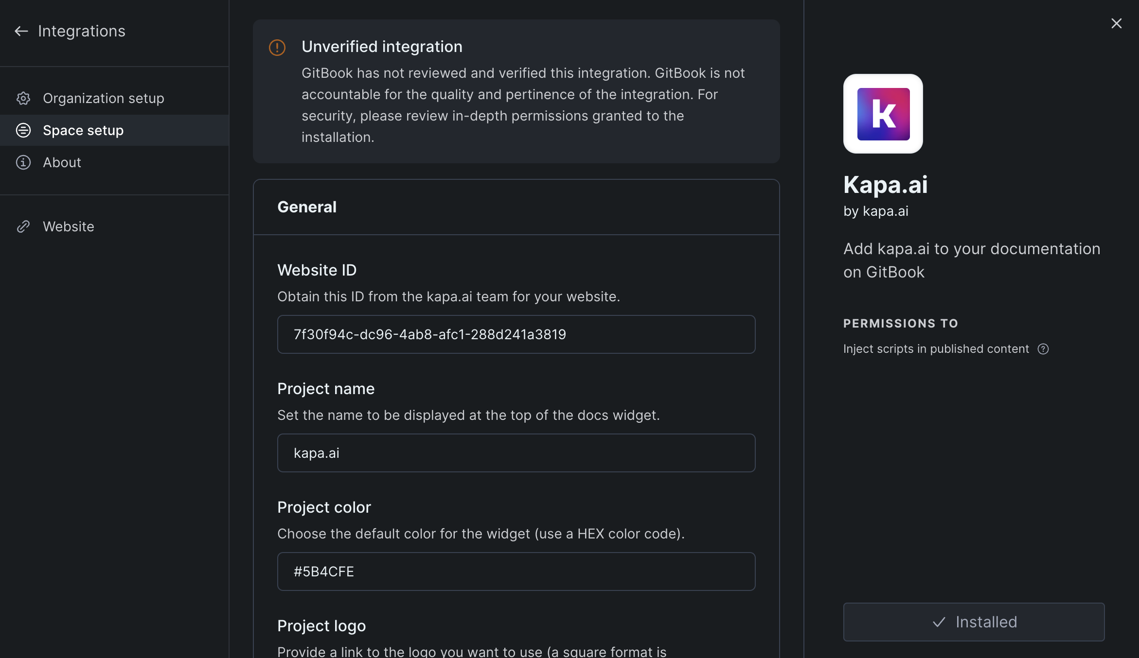
G. GitBook 📖
To install the kapa.ai website widget on GitBook use the kapa.ai plugin for GitBook:
- Install the Kapa.ai GitBook plugin in your GitBook space.
- Use the GitBook UI to configure the plugin with your project parameters. You can configure all parameters described in Step 1.
- It might be necessary to trigger a rebuild of the GitBook space to ensure that changes to the Kapa integration configuration are applied. You can do this by publishing an arbitrary change request.
- The kapa.ai website widget should now be installed and visible on your documentation pages.
H. Sphinx 📁
To install the kapa.ai website widget in Sphinx, follow these steps:
Create a Custom JavaScript File:
- In your Sphinx project directory, navigate to or create the
_staticdirectory. - Create a new file named
custom.jsin the_staticdirectory. - Add the following code to the
custom.jsfile:Replacedocument.addEventListener("DOMContentLoaded", function () {
var script = document.createElement("script");
script.src = "https://widget.kapa.ai/kapa-widget.bundle.js";
script.setAttribute("data-website-id", "XXX-XXX-XXX");
script.setAttribute("data-project-name", "PROJECT_NAME");
script.setAttribute("data-project-color", "#HEX_COLOR_CODE");
script.setAttribute(
"data-project-logo",
"https://LINK_TO_LOGO.com/logo.png"
);
script.async = true;
document.head.appendChild(script);
});XXX-XXX-XXX,PROJECT_NAME,#HEX_COLOR_CODE, andhttps://LINK_TO_LOGO.com/logo.pngwith your specific project parameters.
- In your Sphinx project directory, navigate to or create the
Create a Custom CSS File:
In some Sphix setups overriding the CSS is necessary to ensure the widget appears correctly.
In the same
_staticdirectory, create a new file namedcustom.css.Add the following CSS to the
custom.cssfile to ensure correct widget positioning:#kapa-widget-container {
z-index: 10000 !important;
position: absolute !important;
}
.mantine-Modal-root {
z-index: 10000;
position: absolute;
}
Modify the
conf.pyFile:- Locate the
conf.pyfile in your Sphinx project directory. - Add the following options to your Sphinx configuration:This will include the
html_static_path = ["_static"]
html_js_files = ["custom.js"]
html_css_files = ["custom.css"]custom.jsandcustom.cssfiles in the build output.
- Locate the
Commit and Push the Changes:
- Commit and push the changes to your repository.
I. Freshdesk Integration 🌐
To integrate the kapa.ai website widget with Freshdesk, follow these steps:
Access Freshdesk Admin Panel:
- Log in to your Freshdesk account as an administrator.
- Navigate to the Admin tab.
Create a Custom App:
- In the Admin panel, go to Apps > Custom Apps.
- Click on New App and select Custom App.
Configure the App Settings:
- Give your app a name (e.g., "Kapa AI Widget").
- In the App Locations section, choose where you want the widget to appear within Freshdesk (e.g., Ticket Details Page, Solutions Article Page).
Add the Widget Script:
- In the App Configuration section, paste the following script:
<script
  src="https://widget.kapa.ai/kapa-widget.bundle.js"
  data-website-id="XXX-XXX-XXX"
  data-project-name="PROJECT_NAME"
  data-project-color="#HEX_COLOR_CODE"
  data-project-logo="https://LINK_TO_LOGO.com/logo.png"
></script>
- Save the App and Publish:
- Click Save to save the app.
- Click Publish to make the app available to your agents.
Note: If you encounter any issues, check if there are any script conflicts or content security policy (CSP) settings that might be blocking the widget. Adjust the settings as necessary and contact the kapa.ai team for support if needed.
Step 3: Whitelist reCAPTCHA
The Website Widget implements invisible reCAPTCHA to protect against bad actors connecting to your kapa instance programmatically. This determines whether a person interacting with your widget is a real human or a bot. Only real humans are allowed to submit questions through the widget. The domain on which you are installing the Website Widget has to be whitelisted by the kapa team. Simply share your target domain and any staging domains with the kapa team and they will whitelist them for you immediately. If reCAPTCHA is not whitelisted you will see this error message in your widget:
“ReCAPTCHA token not yet configured. Please reach out to the kapa team at founders@kapa.ai to complete the setup.”
FAQ❓
If you have any questions or need further assistance, don't hesitate to reach out to our team.
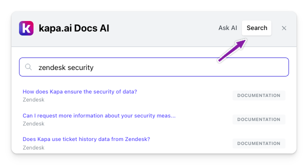
How do I enable search mode?
By default, search mode is not enabled. To enable search mode you just need to set the data-search-mode-enabled parameter to "true" and it will appear on the widget. You can try the "Ask AI" kapa widget on this page on the bottom right corner to see what this looks like.
If you want to have the kapa search override your existing search you just need to set the data-modal-override-open-class parameter the class name of your existing search button (e.g., "my-search-bar-class") to override the modal open behavior.
There are more search configuration parameters listed above to e.g., specifcy sources returned and preferred order.
Can I listen to events?
Yes, the kapa widget exposes a set of events that can be listened to via the kapa Web API, allowing any type of action to be triggered based on those events.
This is useful if you want to track kapa usage in your analytics stack, such as tracking submitted questions in tools like Mixpanel, Amplitude, Segment, etc.
For more information on how to implement event listeners, refer to the kapa Events API reference.
What are the default rate limits?
- Per IP address
- Second: 1
- Minute: 5
- Hour: 20
- Day: 50
- Per website
- Second: 10
- Minute: 100
- Hour: 500
- Day: 2000
Can I configure the rate limits?
- Yes you can configure all of these limits. Simply reach out to the kapa team and we will help you set up the limits that fit your needs.
What happens if I go over the set limit?
- IP rate limit:
- If a user goes over the IP rate limit they will be shown an error message inside the widget until his usage falls under the rate limit again. All other users on the website are not affected.
- i.e.
“Question limit reached, please wait a few minutes and try again.”
- Website rate limit
- This rate limit is shared by all users to the website. When the website goes over the limit all users of the widget will see an error message until the usage is under the limit again:
- i.e.
"System capacity reached, please wait a few minutes and try again.”